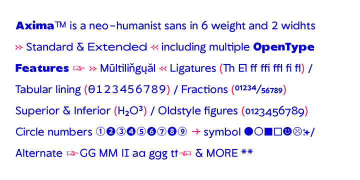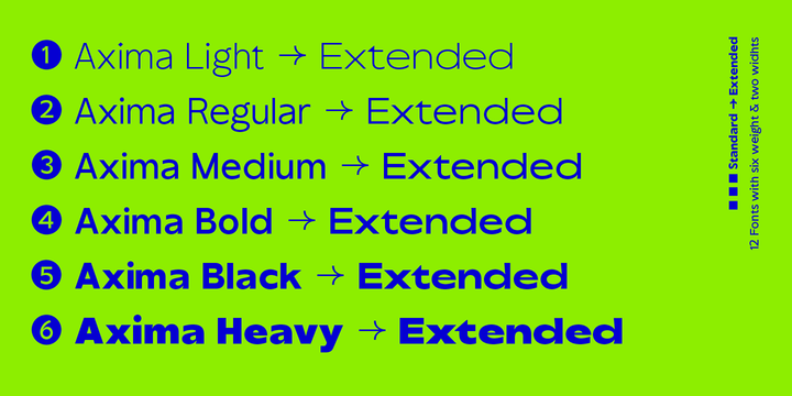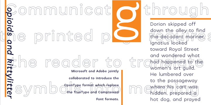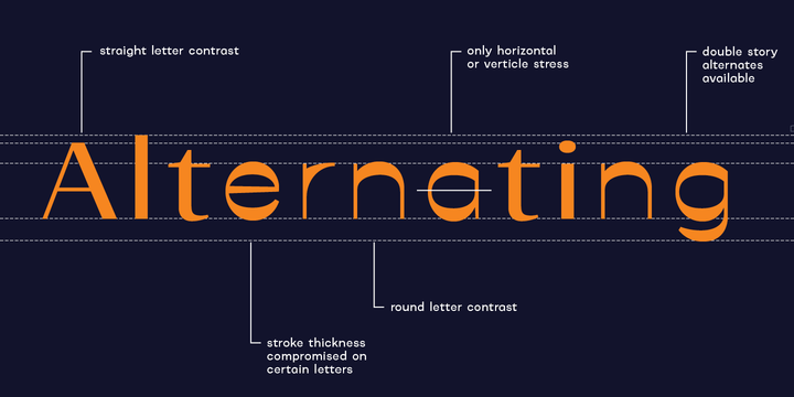
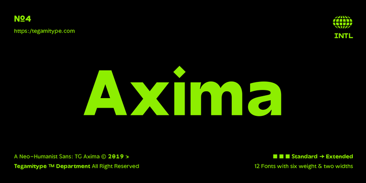
TG Axima is a neo-humanist sans, with 6 weights & 2 widths with a total of 12 font. Inspired from humanist fonts like Frutiger and gill sans with touched post-modern. TG Axima is a perfect match for editorial design even for experimental design. Looks great at the small details or the bigger size.
Showing posts with label experimental. Show all posts
Download Katlynne Font Family From Ryan Williamson
October 04, 2019
alternating contrast
,
DISPLAY
,
experimental
,
eye catching
,
Hebrew
,
reverse contrast
Katlynne is unpredictable.
Katlynne is erratic.
Katlynne is beautiful.
Katlynne is an alternating contrast, sans serif type family. Arbitrarily separating the characters into ‘rounder’ and ‘straighter’ letterforms to determine what contrast each glyph will take.
Katlynne is inspired by the observations made while watching the inexperienced use of broad tip pens. I found how and when individuals rotated their pen gave a visually intrusive, if not also pleasantly conspicuous effect. Often, the pen would naturally rotate horizontally (vertical contrast) on the rounder letterforms, and vertically (reverse contrast) on the straighter ones. This is more or less the formula Katlynne adopts as the contrast changes throughout the styles.
Katlynne’s severity of contrast varies from ‘Negative Three’ to ‘Positive Three’ in four weights. With a central style ‘Book’ being the sensible, low contrast font in the family.
Within the family there are four weights with 7 contrast styles, with complimenting true italics. Giving a total of 56 fonts!
Katlynne's array of options works for creating stylistic similitude within layouts, where conspicuous title faces are needed with a cohesive text face to compliment. Alone, the ends of the contrast spectrum (Negative and Positive Three) create striking word forms for advertising, packaging and anywhere else a loud voice is needed.
Download Styro Font Family From Indian Type Foundry
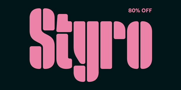
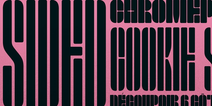
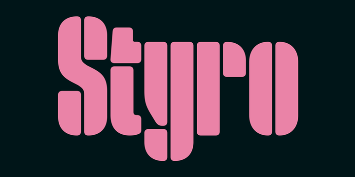
Styro is a family of modernist-style stencil fonts. There are eight weights available, ranging in color from Thin through Black. All of the typeface’s weights are virtually monospaced, and with each weight of the family, the outside ‘strokes’ building up the letterforms increase in thickness. Styro’s characters are very condensed, and their design employs a reductionist formal vocabulary. For example, the counter-forms are expressed by thin lines that run inside of the letters, from their tops to their bottoms. These ‘counters’ are optically of the same width as the spaces between each letter. Many of the fonts’ stroke terminals – like those on the top of the ‘a’ or on the bottom of the ‘g’ – are reduced to simple geometric shapes. Diacritic marks take the form of light thin lines, which create a nice degree of contrast with their base letters. This thin-line treatment is also applied to many of the fonts’ punctuation marks. Styro is reminiscent of a series of stencil letters designed at the Bauhaus by Josef Albers, although Styro includes separate shapes for both uppercase and lowercase letters, instead of being a unicameral design. The Styro fonts were developed by Aarya Purohit at Indian Type Foundry, and they are an excellent choice for use in editorial design pieces about modern art and design.
Download Kihim Font Family From Indian Type Foundry
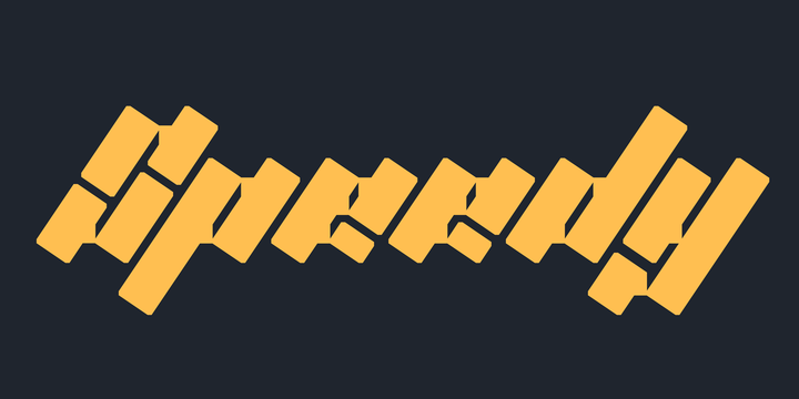
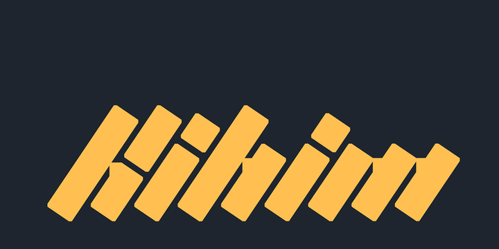
Kihim in a single-weight display typeface. It is grid-based design – and a very decorative one at that. All of its letterforms are set on an extreme angle. The ‘tops’ and ‘bottoms’ of each stroke reflect that angle, giving the typeface a ‘rotalic’ feeling, as if each letterform was rotated clockwise. Designed by Hitesh Malaviya, Kilhim is his interpretations of the late artist Nasreen Mohamedi’s drawings and photographs. Through the interplay of light and shadows, her work explored the creation and consumption of form. It featured highly structured grids, just like this typeface. Her work achieved a unique level of abstraction, in which simple marks caused grids to form and deform. In her photography, she concentrated on sparseness and shapes. Physical space occupied by the body was a point of departure for her. Beyond the body, there was the urban fabric of the city: the spaces created by walls, windows and intervals in architectural structures, through which people pass. Her almost mathematical placement of lines indicated a sophisticated handling of formal/aesthetic relations on the picture plane, and she carefully weighed the intervals between lines, releasing them onto the page with a rhythmic flow that alluded to musical notation. A lot of intriguing glyph repositioning happens with text set in Kihim, once OpenType features like ‘Contextual Alternates’ are activated. The font also has oldstyle figures as an optional OpenType feature, which is really quite an opulent extra for such an ornamental display typeface. With Kihim’s abstract letterforms and its use of diagonal lines, Malaviya pays homage to the rhythmic quality of Mohamedi’s oeuvre. Often, text in Kihim seems illegible or unrecognisable at first, before the reader starts to see through the rhythmic pattern of thick and thin lines: then one starts to se the written word. The Kihim typeface is named after the place where Mohamedi passed away in 1990, when she was only 53.
Download Rothek Font Family From Groteskly Yours
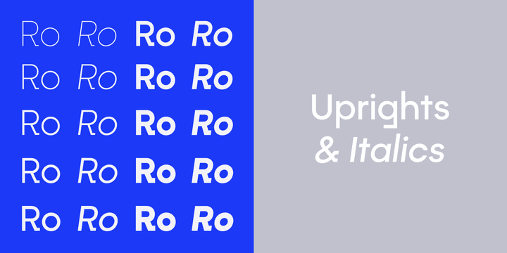
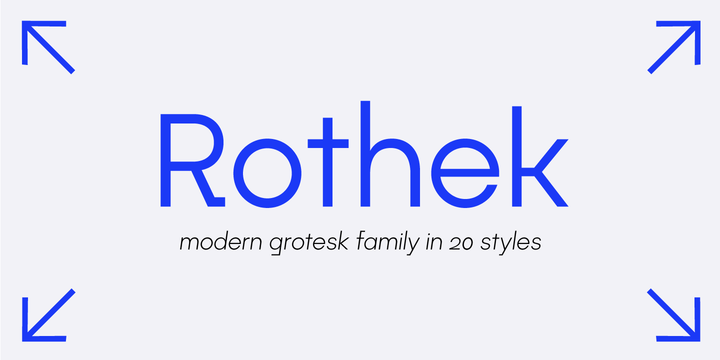
Rothek is a geometric sans serif type family with a strong and unique character. It comes in 20 weights — 10 uprights and 10 italics — and is a perfect tool for any designer who needs a versatile font for a variety of projects. While retaining its uniqueness and whimsicality, Rothek is highly legible even at smaller weights, which makes it a perfect fit for app and web design.
But what’s really great about Rothek is its OpenType features, which make it really stand out. Not only does it know how to do fractions, but it also does subscript and superscript; it’s equipped with case-sensitive punctuation, which adjusts the height of your parentheses, hyphens (and many more) to the height of your letters. But there’s still more: Rothek is loaded with various figures — from default proportional numerals to oldstyle figures, tabular figures and tabular oldstyle figures.
As for language support, there’s plenty. Rothek is fluent in all European languages, as well as Vietnamese and Pinyin. On top of that there’s Adobe Extended Cyrillic set for most Slavic languages. As a cherry on top, there are stylistic alternatives for selected glyphs both in Latin and Cyrillic layouts and lots of extra symbols to work and experiment with.
With 761 glyphs in each style, Rothek is a perfect workhorse font for those who always wanted a modern sans serif font with a strong character.
Download Zoelander Font Family From Locomotype
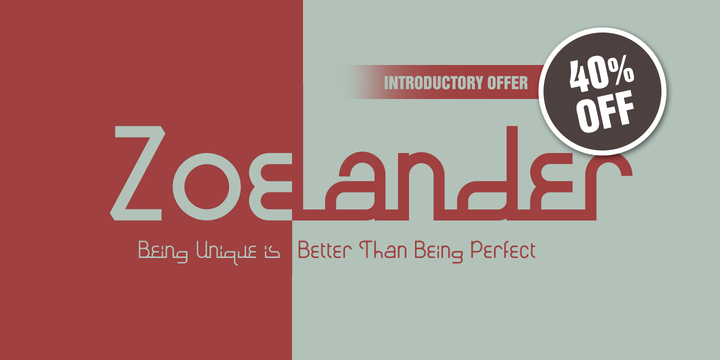
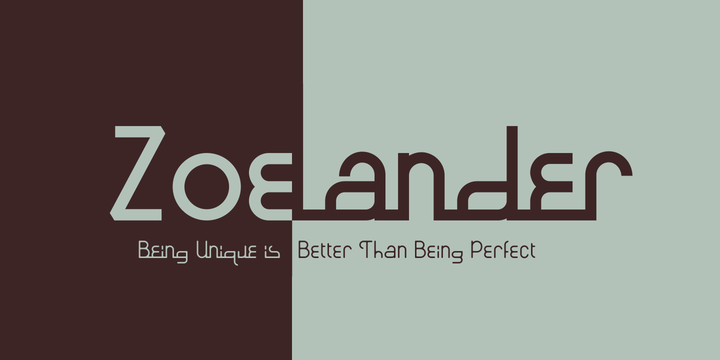
Zoelander is an experimental geometric font. The distinctive feature of this font is having an irregular x-height. This will look unusual, but if you are looking for something unique and looks different, Zoelander can be an alternative to making an attractive typography.
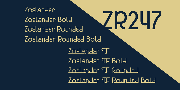
Zoelander comes in two versions, Zoelander Regular and Zoelander TF. Each has a bold and rounded style. Zoelander Regular is a sans serif font with irregular x-height but if you want the same x-height size, the stylistic alternates feature allows you to do it. While Zoelander TF is the development of a regular version where each letter is connected in a line at the baseline. Some of the other opentype features make it easier for you to explore more interesting typographic designs.
Subscribe to:
Posts
(
Atom
)